In today’s digital world, typography plays a critical role in creating a seamless user experience (UX) for websites and applications. Choosing the right font for your design can greatly influence the overall look and feel of the user interface.
With Google’s vast collection of fonts, it can be overwhelming to pick the right one. However, when it comes to UX, sans serif fonts are a popular choice. They are clean, modern, and easy to read, making them ideal for digital applications.
In this article, we will explore the 5 best Google sans serif fonts for UX in 2023 and provide pairing examples to help you get started with your next design project.
What is a Sans Serif Font?
Sans Serif fonts are an essential tool for designers looking to create clean and modern designs that are easily legible on digital devices. It is a typeface style that doesn’t include the decorative flourishes or “serifs” at the ends of each letter.
Instead, it features a more streamlined and minimalistic look, making it an ideal choice for modern and digital mediums. Sans Serif fonts are used for both display and body text, making them versatile and well-suited for a variety of design purposes.
What are the Advantages of Sans Serif Fonts?
One of the key advantages of sans serif fonts is their legibility and readability. The lack of serifs makes the text appear cleaner and easier to read on digital devices such as computer monitors and smartphones. This is especially important for designers who want to create content that is easily digestible on digital platforms.
Another advantage of sans serif fonts is that they have a more modern and contemporary feel. This is why they are widely used in branding, marketing, and web design, where a sleek and modern look is desired. They are also considered more versatile than serif fonts because they can be used in a variety of design styles, from minimalist to geometric to more decorative.
Finally, sans serif fonts are relatively small in file size and load quickly, making them ideal for websites. They also tend to be easier to work with, as they don’t need to be tweaked and adjusted as much as serif fonts do. This makes them easier and quicker to work with during the design process.
What Makes a Sans Serif Font Good for UX?
A sans serif font can greatly impact the user experience of a website or application. When it comes to designing for UX, choosing the right typeface is crucial, as it can influence legibility, readability, and overall user satisfaction.
A good sans serif font for UX should meet the following criteria:
- Legibility: The most important aspect of a font for UX is legibility. A good sans serif font should be easy to read and distinguish, even at small sizes. This is particularly important for body text, as users need to be able to easily comprehend the information presented.
- Readability: In addition to legibility, readability is also significant. A sans serif font should have good spacing between characters and lines, and a clear structure that makes it easy for users to follow along.
- Consistency: Consistency is key for UX, and this applies to the typeface as well. A good sans serif font should maintain its shape and style throughout the design, so that users can easily recognize it and feel comfortable with it.
- Personality: A sans serif font should also have a personality that matches the brand or product it is being used for. This can be achieved through the style, weight, and character of the typeface, and can help to create a memorable and distinctive experience for users.
- Flexibility: A good sans serif font should be flexible enough to be used in a variety of contexts, such as headings, body text, captions, and more. It should also have multiple weights and styles to provide versatility and accommodate different design needs.
Designers can select a sans serif font that enhances user experience by taking into account these important factors, ultimately leading to a positive and user-friendly design.
The 5 Best Sans Serif Fonts
With the vast array of choices available, it can be challenging for designers to choose the right sans serif font for their designs.
To help you make the best choice for your design needs, we have curated a list of the 5 best sans serif fonts for 2023.
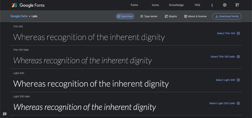
1. Lato
Lato has gained popularity among designers due to its sleek and modern appearance and readability at small sizes. It is available in a range of styles, from the light and airy Lato Hairline to the bold and impactful Lato Black. The font is suitable for logos and branding, web design, and printed materials.
One of the stand out features of Lato is its humanistic design, which draws inspiration from classical serif fonts such as Garamond but with a modern twist. The curves in the letterforms are slightly rounded, giving it a warm and friendly feel, while the straight lines are more geometric, providing stability and structure.
In addition to its design, Lato is also optimized for web design. The font includes support for a various scripts and languages, including Latin, Greek, and Cyrillic, and uses OpenType features to provide added versatility. For example, designers can use stylistic alternates to create a more unique look or small caps to enhance text readability.
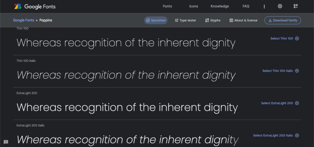
2. Poppins
The Poppins typeface offers an excellent balance between readability and versatility. It strikes a nice balance between clean and modern appearances, making it a great choice for a variety of design applications.
For users, the most notable feature of Poppins is its versatility and readability. It contains eight weights, ranging from thin to heavy, and is suitable for a wide range of applications. Its geometric forms, including the circular o and the pointed a, make it easy to distinguish between different characters and provide clear, legible text.
For designers, Poppins is a great choice for UI/UX applications. Its tall x-height and short descenders give it ample space to fit into different environments, while its consistent letterforms and open counters make it great for text-heavy designs. Its low contrast design also makes it a great choice for small sizes, as it increases readability at small sizes.
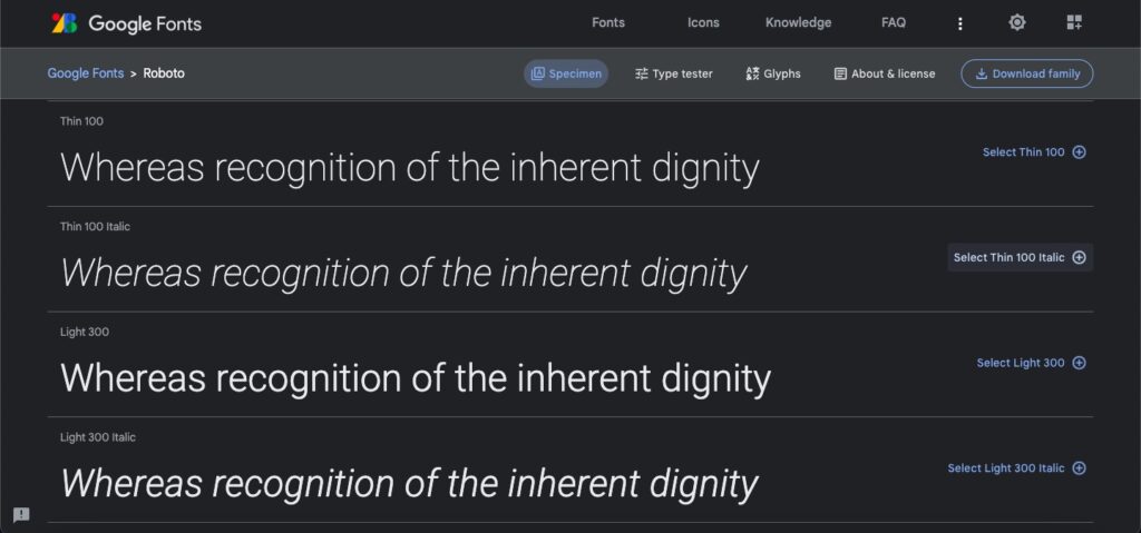
3. Roboto
Roboto is a geometric sans-serif font released by Google as the default font for the Android operating system. It has become a popular choice for user interfaces and brand identity, with its simple, modern aesthetic and wide range of styles.
Roboto has a large x-height, which makes it highly legible on screens, and generous spacing between letters. It also features strong vertical emphasis and a slight cursive feel that gives it a friendly and approachable look. The font is available in nine weights, from thin to black, and is designed to work well in a variety of contexts.
This Google font is optimized for use on digital displays and is supported by all modern web browsers. It is also available in OpenType font format, with extensive language support, which makes it easy to use for global audiences. Roboto also includes a number of other features, such as fractional tabular widths, small capitals, and stylistic alternates.
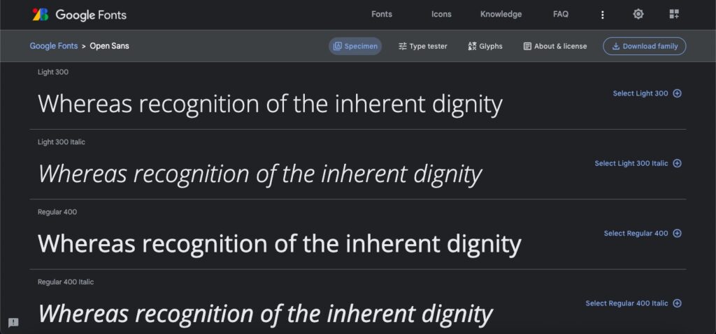
4. Open Sans
Open Sans is a great choice for any project that needs a contemporary, clean, and legible font. It is a humanist typeface, meaning that it is designed to imitate the look and feel of human handwriting.
The font is characterized by its open letter forms, clean lines, and a large x-height. It is highly legible, and its letterforms are optimized to create a harmonious typographic texture. The stroke weights are consistent throughout the typeface, creating an even visual texture. The family includes eight weights, from light to extra-bold, and italics for each weight.
Open Sans is a great choice for digital design projects, as it is highly readable even at small sizes. It also works well for print applications due to its high-quality. It can be used in a wide variety of designs, from corporate-style websites to personal blogs.
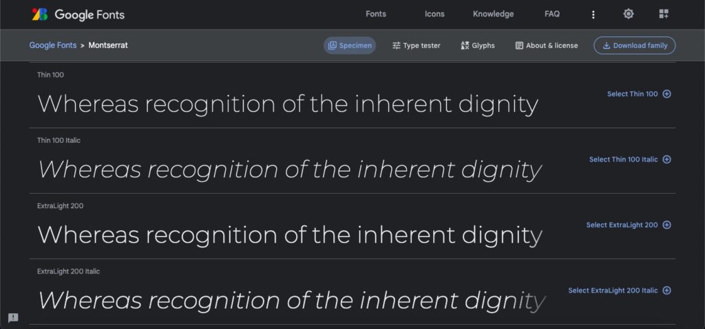
5. Montserrat
Monserrat is a modern classic sans-serif typeface, with a unique design that is both elegant and functional. The font is based on the signage seen in the Montserrat district of Buenos Aires, so it has a distinctively urban feel.
Montserrat is designed to be highly readable, even in small sizes. The letterforms have an open, rounded look, with a thicker, more pronounced stroke. The x-height is taller than the average sans serif, so it stands out on the page. It also includes a wide range of stylistic variants, including italics, small caps, and multiple weights.
Montserrat is an excellent choice for any user interface design, as it is highly legible, and also looks great when used in larger sizes. Also, it is a great choice for logos and branding, since it sepparates out from the crowd and has a unique, urban feel.
Each of these sans serif fonts offers a unique look and feel, and you can choose the best font for your design needs by considering the purpose, target audience, and overall design aesthetic.
The Best Google Font Pairing Examples
To create a more inviting website, you might consider introducing a secondary font that brings a touch of personality to your design. This can be especially useful if your main typeface is quite serious or formal.
To further differentiate sections, like headings, you could select a typeface with heavier weights, widths, and styles. In this way, you can draw attention to certain areas while still keeping a consistent overall look.
But, before beginning to pair fonts, it is important to decide if a second typeface is really necessary. We suggest using an additional font only if it helps create a particular effect for your website.
Here are some ideas for the best font pairing you can use:
Roboto & Oswald – Roboto is a sans-serif font with a modern and professional look, while Oswald is a strong sans serif font with a bold look. As the combination of a sans serif and a slab serif font theybring balance and contrast to the design.
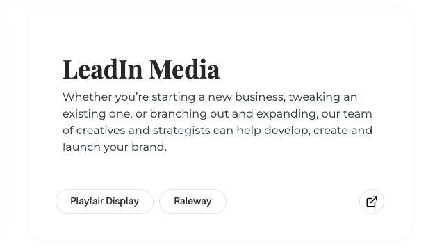
Raleway & Playfair Display – Raleway’s thin strokes and modern design pair nicely with Playfair Display’s classic look. It’s an ideal choice for any project that needs a touch of modernity without sacrificing readability.
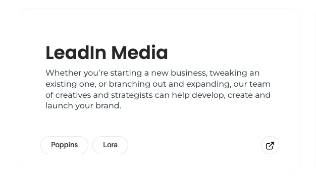
Poppins & Lora – Poppins and Lora make a harmonious font pairing due to their complementary design styles. Poppins provides a modern and clean look, while Lora adds a touch of elegance and sophistication with its serif details.
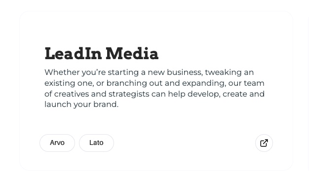
Lato & Arvo – Lato is a beautiful sans-serif font with rounded edges, while Arvo is a sturdy serif font with an old-fashioned feel. This pairing is ideal for projects that need to look both modern and traditional.
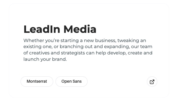
Montserrat & Open Sans – Combining Montserrat’s stylish sans-serif design with Open Sans’ neutral and readable appearance forms a versatile font pairing. This pairing is offers both character and functionality.
Looking to Boost Your Design with the Best Sans Serif Google Fonts?
The world of typography is crucial for creating effective and user-friendly design, and sans-serif fonts play a key role in this. The five best sans serif Google fonts outlined in this article are some of the best for UX design in 2023, each offering a unique combination of design and functionality.
To take your design projects to the next level, consider working with experts like LeadIn Media who can help you elevate your typography and achieve your design goals. Start crafting style that effectively conveys your message and drives success by getting in touch with us today.